Good UX doesn't make the user think. So we stopped making them.
One small transparency fix - putting shipping costs on the product page - drove a 27.7% lift in conversion rate. Here's what we learned.
There's a principle in UX that's easy to quote and hard to follow: don't make the user think. It sounds obvious. In practice, most e-commerce experiences violate it constantly — not through bad design, but through friction so normalised we stop noticing it.
Shipping cost is one of those things. For years, the industry default has been to surface it at checkout. That's where the calculation happens. That's where it technically belongs. But technically correct and user-centred are often different things.
Customers don't want to discover what a product costs at checkout. They want to know before they commit.
What the feedback told us
User feedback kept circling the same theme: surprise at the checkout stage. Not the product price — that was visible. The total price. The one that includes shipping. For a customer who's already decided to buy, that moment of uncertainty is a friction point. For a customer on the edge, it's a reason to leave.
The insight wasn't complex. It was this: if someone is on the product detail page, they're already evaluating. Give them everything they need to decide — right there, right then.
The test
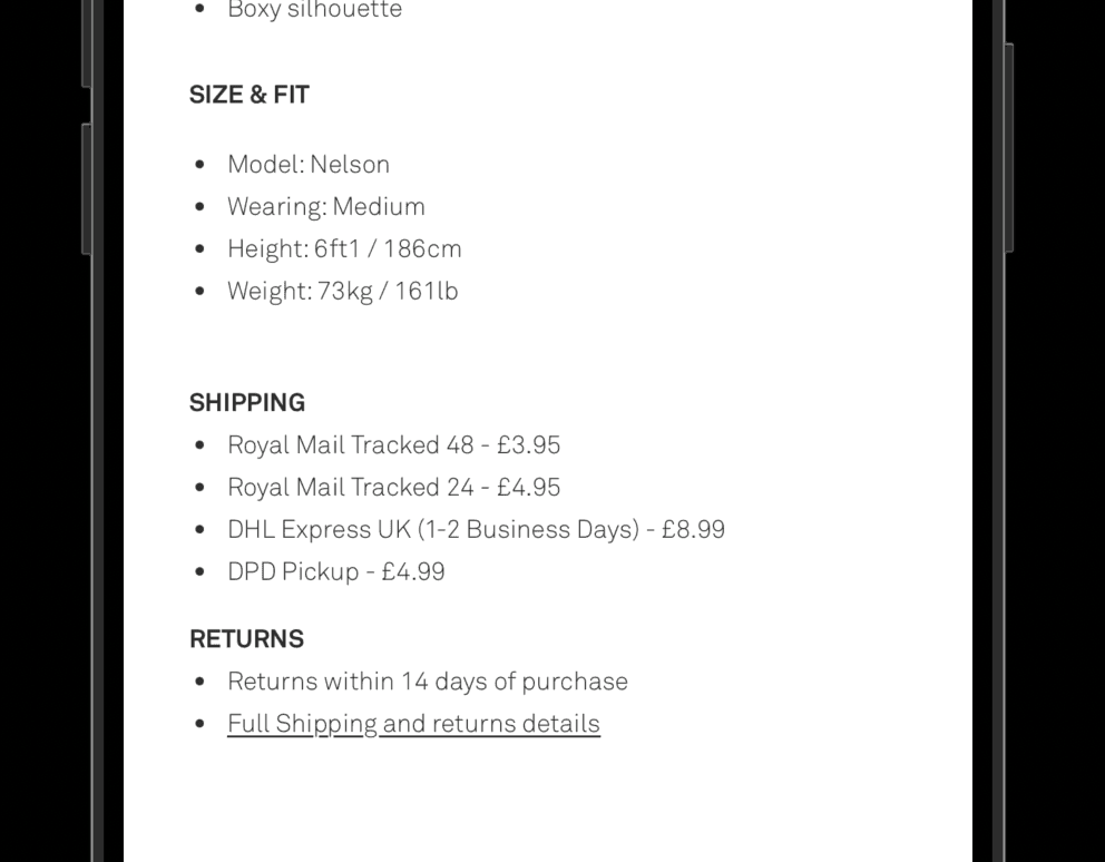
We ran a straightforward A/B test: shipping costs surfaced directly on the PDP, alongside the product price. No hiding the number until checkout. No vague "calculated at checkout" placeholder. Just clear, upfront information.
The hypothesis was that reducing uncertainty early would increase downstream intent — and that customers who added to cart would do so with full confidence, not curiosity.
Why it worked
Two things happened simultaneously. First, the obvious: customers who were being lost to checkout anxiety stayed in the funnel. Transparency replaced doubt. Second, the less obvious: basket size increased. When customers understand the total cost framework early, they're more willing to add additional items — because the mental accounting is already done.
Transparency creates confidence, not hesitation. Customers aren't scared off by knowing shipping costs — they're scared off by not knowing.
The PDP is a decision page, not just a product page. Treat it accordingly.
Reducing cognitive load at one stage reduces friction across the entire funnel.
Basket size lifted because customers were optimising against a full picture of cost, not a partial one.
The broader principle
This test wasn't about shipping costs specifically. It was about the moment a customer decides to trust you. Every piece of information you withhold — even accidentally, even through convention — is a small erosion of that trust. And small erosions compound.
The best UX decisions often aren't about clever interactions or polished components. They're about asking a simpler question: what does the user need to know right now, and are we giving it to them?
A 27.7% CvR lift didn't come from redesigning the experience. It came from respecting the user's time — and their right to make an informed decision.