How One UX Tweak Lifted Conversions by 17.5% - A Sizing A/B Test Win
Sizing is one of the hardest problems in fashion e-commerce.
Not logistics. Not returns. Not even product photography.
The moment a customer can't confidently answer "will this fit me?" - you've lost them. They don't raise their hand and ask for help. They just leave.
This is the story of a small UX change that solved a very old problem. And the +17.5% conversion lift that followed.
The Problem: Information Hiding in Plain Sight
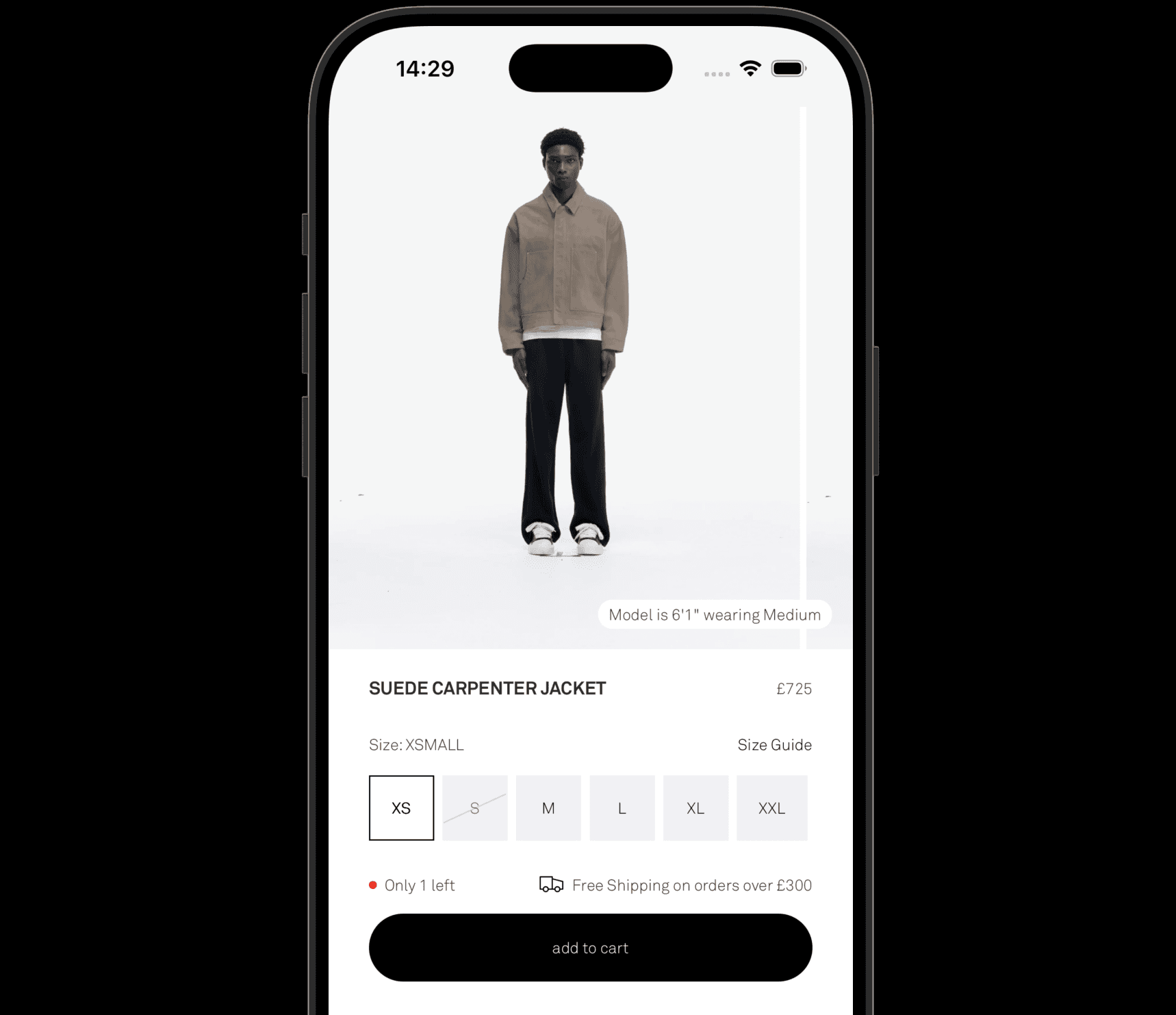
Our client's product pages already had model sizing information. Height, the size worn, measurements - it was all there.
But customers kept asking the same questions over and over. The support inbox was full of sizing queries. The data told us people weren't confident enough to buy.
The information existed. It just wasn't doing its job.
Here's the thing about proximity in UX: if two related pieces of information are separated by even a few hundred pixels, the brain doesn't automatically connect them. Customers were seeing the model in the image. They were also seeing the model info - just not at the same time, in the same glance.
The cognitive load of connecting those two things was enough friction to stop conversions.
The Hypothesis: Collapse the Distance
We made one focused change.
Instead of listing model information in the product description or a tucked-away size guide, we overlaid it directly on the model image. Height, size worn - right there, anchored to the visual.
Two related pieces of information. Zero gap between them.
The Gestalt principle of proximity tells us that things that appear close together are perceived as related. We weren't adding new information. We were just making the relationship between the model and the data obvious.
The Result
The test ran. The numbers came in.
A 17.5% uplift in conversions. From one change. No new products, no new traffic, no discounting.
Just information, placed where the customer needed it, when they needed it.
What This Means for Your Store
This test is a reminder that CRO isn't always about big swings. Sometimes the biggest wins come from asking: what does the customer need to feel confident right now - and is it visible?
For fashion brands specifically, sizing hesitation is one of the most common and most underestimated conversion killers. If your customers are asking sizing questions, that's not a customer service issue. That's a UX issue.
Questions worth asking on your own PDPs:
Is model info visible on the image, or buried below the fold?
Can a customer answer "will this fit me?" without scrolling?
Are you presenting size information at the moment of visual engagement?
If the answer to any of those is no - you've got a test to run.
Serif Creative is a boutique Shopify design and CRO agency working with fashion and lifestyle brands. If you're interested in what a structured CRO audit could unlock for your store, get in touch.